Amazon A+ Content Charts: Mistakes to Avoid

Amazon A+ Content comparison charts are powerful conversion tools, but many sellers make avoidable mistakes that hurt sales. In this guide, you'll learn the most common errors, how to evaluate chart generators, and practical steps to create effective charts for your cross-border e-commerce listings.
Why Amazon A+ Content Comparison Charts Matter in 2026

In 2026, Amazon's A+ Content is a standard for product listings, and comparison charts are a powerful component. They let shoppers quickly see how your product stacks against alternatives, directly influencing purchase decisions. For cross-border e-commerce sellers, a well-designed comparison chart can reduce return rates, improve conversion, and build trust. However, mistakes in chart creation can undermine your efforts, leading to confused customers and lost sales.
This article covers the most frequent errors sellers make with A+ Content comparison charts, from data inaccuracies to design flaws. You'll learn how to evaluate chart generators, what trade-offs to consider, and how to avoid pitfalls. Whether you're a seasoned seller or just starting, these insights will help you create effective comparison charts that drive results.
- Comparison charts increase time-on-page and reduce bounce rates.
- They clarify product differences, reducing pre-purchase uncertainty.
- Poorly designed charts can lead to customer dissatisfaction and negative reviews.
Key Categories of Amazon A+ Content Comparison Chart Generators
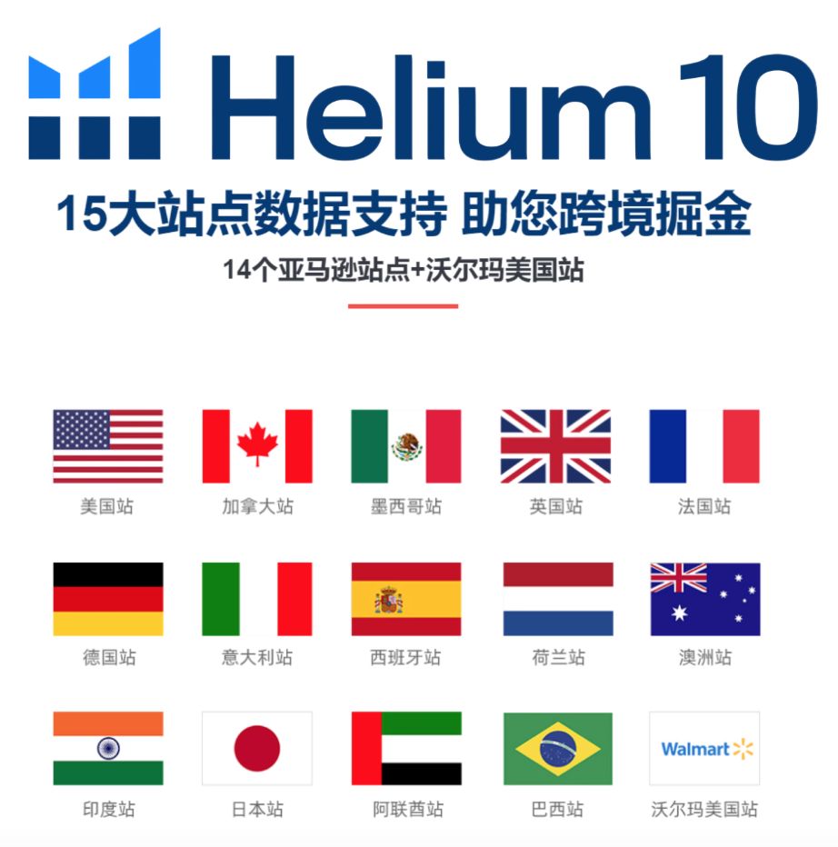
Amazon offers native A+ Content modules, but for comparison charts, sellers often use third-party tools or manual design. The main categories are: (1) Amazon's built-in comparison table module (available in A+ Content manager), (2) standalone graphic design tools like Canva or Adobe Illustrator, and (3) specialized e-commerce content tools like Helium 10 or Jungle Scout that integrate with Amazon.
Each has its strengths: Amazon's module is free and simple but limited in customization. Graphic design tools offer full creative control but require design skills. Specialized tools often include templates and automation but come with subscription costs. Typical prices range from free (Amazon module) to $30–$100 per month for professional tools (indicative, subject to change).
- Amazon's native comparison table: basic, no cost, limited styling.
- Graphic design software: flexible, but manual work and learning curve.
- E-commerce suites: templates, data integration, but recurring fees.
How to Evaluate Comparison Chart Generators: Criteria and Trade-offs
When choosing a generator, consider ease of use, template quality, data handling, and Amazon compliance. A good tool should let you import product data (e.g., from a spreadsheet) to avoid manual errors. It should also produce mobile-responsive charts, as most shoppers browse on phones.
Trade-offs exist: Free tools save money but may lack advanced features like auto-updating data or brand customization. Paid tools offer more, but you must weigh the cost against your expected ROI. Also, check if the tool generates code that Amazon accepts—some tools output HTML that isn't compatible.
Typical features to compare: drag-and-drop interface, pre-built templates, image upload, and export formats. Look for a tool that allows A/B testing of chart variations. Prices for paid tools vary, but you can find options from $20 to $100 per month (indicative).
- Ease of use: Can you create a chart in under 30 minutes?
- Data integration: Does it support CSV import or API?
- Mobile optimization: Does the chart display well on small screens?
- Compliance: Does it adhere to Amazon's A+ Content guidelines?
- Support: Is there customer service or documentation?
Common Pitfalls When Dealing with Amazon A+ Content Comparison Charts
One major mistake is comparing your product to irrelevant competitors. Your chart should only include products that are direct alternatives, not generic ones. Another pitfall is using vague attributes like 'high quality' without specifics—use measurable data like dimensions, material, or warranty.
A frequent technical error is uploading images that are too small or low-resolution, which Amazon may reject. Also, forget to test on mobile: a chart that looks great on desktop may be unreadable on a phone. Finally, some sellers update charts infrequently, leaving outdated information that misleads customers.
Data accuracy is paramount. If you claim a feature that your product lacks, you risk negative reviews and returns. Always verify your data and your competitors' data, as they may change. Use a reliable generator that allows easy updates.
- Comparing to non-competitors or irrelevant products.
- Using subjective language instead of measurable specs.
- Ignoring mobile layout and font sizes.
- Neglecting to update charts after product changes.
- Misrepresenting competitor data, leading to trust issues.
Practical Recommendations and Next Steps
To avoid these pitfalls, start by listing your top 3-5 competitors and gather accurate data on their products. Choose a generator that fits your budget and skill level—if you're new, start with Amazon's native module or a free tool like Canva. For advanced needs, consider a paid tool with templates and data import.
Create a chart with 5-7 rows maximum, focusing on attributes that matter most to buyers (price, size, material, warranty, key feature). Use clear icons and high-contrast colors. Always preview on both desktop and mobile before publishing.
Finally, monitor your chart's performance using Amazon's Brand Analytics. If you see high page views but low conversion, consider A/B testing different chart layouts. Set a reminder to review your charts quarterly to keep data current.
- Draft a list of key competitor products and features.
- Select a tool based on your budget and technical comfort.
- Design with mobile-first in mind and keep it concise.
- Publish, then analyze performance and iterate.
Key Takeaways
In summary, Amazon A+ Content comparison charts can significantly boost your product's appeal if done right. Avoid the pitfalls of irrelevant comparisons, vague data, and poor mobile design. Choose a generator that balances cost, ease, and compliance, and regularly update your charts. Next, audit your current A+ Content, implement these tips, and track your conversion rates to see improvement.
This article is compiled by kuajing168.cn for reference only. Please refer to the official announcements of each platform for the latest policies and rates.
© 版权声明
文章版权归作者所有,未经允许请勿转载。
相关文章





暂无评论...
Warning: Illegal string offset 'count' in /www/wwwroot/www.kuajing168.cn/wp-content/themes/onenavtt/inc/widgets/w.carousel.php on line 239
Warning: Illegal string offset 'imgs' in /www/wwwroot/www.kuajing168.cn/wp-content/themes/onenavtt/inc/widgets/w.carousel.php on line 240
Warning: Invalid argument supplied for foreach() in /www/wwwroot/www.kuajing168.cn/wp-content/themes/onenavtt/inc/widgets/w.carousel.php on line 243
Warning: Illegal string offset 'is_tow' in /www/wwwroot/www.kuajing168.cn/wp-content/themes/onenavtt/inc/widgets/w.carousel.php on line 264
Warning: Illegal string offset 'two' in /www/wwwroot/www.kuajing168.cn/wp-content/themes/onenavtt/inc/widgets/w.carousel.php on line 265
Warning: Illegal string offset 'is_hot' in /www/wwwroot/www.kuajing168.cn/wp-content/themes/onenavtt/inc/widgets/w.carousel.php on line 299
Warning: Illegal string offset 'hot' in /www/wwwroot/www.kuajing168.cn/wp-content/themes/onenavtt/inc/widgets/w.carousel.php on line 300
Warning: Illegal string offset 'title_ico' in /www/wwwroot/www.kuajing168.cn/wp-content/themes/onenavtt/inc/widgets/w.carousel.php on line 300
Warning: Illegal string offset 'hot' in /www/wwwroot/www.kuajing168.cn/wp-content/themes/onenavtt/inc/widgets/w.carousel.php on line 300
Warning: Illegal string offset 'title_ico' in /www/wwwroot/www.kuajing168.cn/wp-content/themes/onenavtt/inc/widgets/w.carousel.php on line 300
Warning: Illegal string offset 'hot' in /www/wwwroot/www.kuajing168.cn/wp-content/themes/onenavtt/inc/widgets/w.carousel.php on line 303
Warning: Illegal string offset 'title' in /www/wwwroot/www.kuajing168.cn/wp-content/themes/onenavtt/inc/widgets/w.carousel.php on line 303
Warning: Illegal string offset 'hot' in /www/wwwroot/www.kuajing168.cn/wp-content/themes/onenavtt/inc/widgets/w.carousel.php on line 304
Warning: Illegal string offset 'post_type' in /www/wwwroot/www.kuajing168.cn/wp-content/themes/onenavtt/inc/widgets/w.single.posts.php on line 212
Warning: Illegal string offset 'post_type' in /www/wwwroot/www.kuajing168.cn/wp-content/themes/onenavtt/inc/widgets/w.single.posts.php on line 226
Warning: Illegal string offset 'only_title' in /www/wwwroot/www.kuajing168.cn/wp-content/themes/onenavtt/inc/widgets/w.single.posts.php on line 227
Warning: Illegal string offset 'orderby' in /www/wwwroot/www.kuajing168.cn/wp-content/themes/onenavtt/inc/widgets/w.single.posts.php on line 235